KINDREDNOTES
UXR & UX Design
“I was extremely pleased with the results. I would recommend Annie (Yining) to anyone looking for UX/UI design services.”
— Shelley Moore - Founder of KindredNotes
BRIEF
A MOBILE EXPERIENCE ENABLE USERS SPREAD KINDNESS AT THE FINGERTIPS
KindredNotes is a Vancouver based start-up that aims to connect people around the world through sending and receiving kind notes. Even though there is an working website, the company hasn’t releasing an app yet. Our goal was to take a mobile-first approach to design an engaging experience for users sending and receiving notes in a deep psychological level and also be able to see their impact to the world.
Research Process
DEFINE AND UNDERSTAND USERS' BEHAVIORS
First challenge is to find the liking and behavior of the users, and through 20 responses and 6 interviews, we learn that users fall to the age of 25 to 34, they like to type something short and quick with a positive tone and they would be happy to have a reward system (such as In-App services).
User story
IMAGINING THE USERS' EXPERIENCE
I focused on creating a user story and user scenario to understand their experience. I wanted to allow users to tell us how they wanted their app delivered. If users can tailor it to fit their mentalities and interests, they are more likely to stick to the service.
Meet Doris!

Doris is a 26-year-old illustrator who likes to read before going to sleep. She likes her job because she can work from home. However, she feels lonely sometimes and wish someone could encourage her. One day, after a long day, she especially urged for some comfort. While googling the keyword ‘how to get motivated’, she found KindredNotes that for people to spread kindness online…she was curious and would like to know more…
User scenario & storyboard
Doris's day
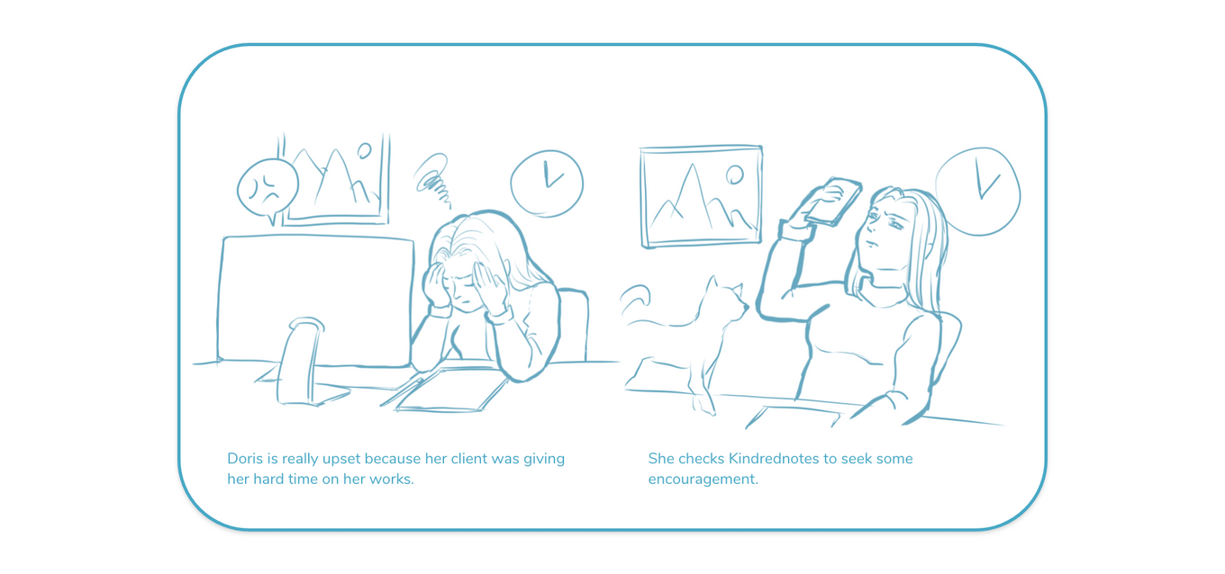
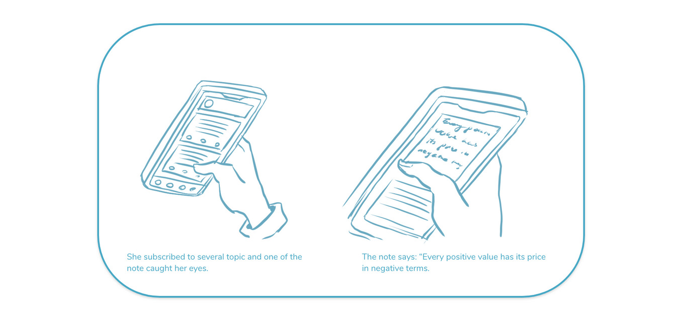
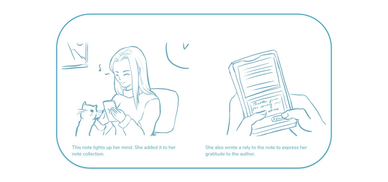
CREATE VALUE WITH IN-DEPTH CONNECTION
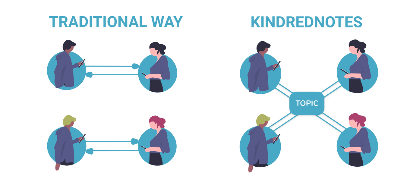
Before, people connect to each other but only talk about superficial things. Now, KindredNotes connects users with topics that they really care. The value of it is through the simple gesture, we can share in-depth understanding with great positivity power, but still able to keep the space and privacy that people need.
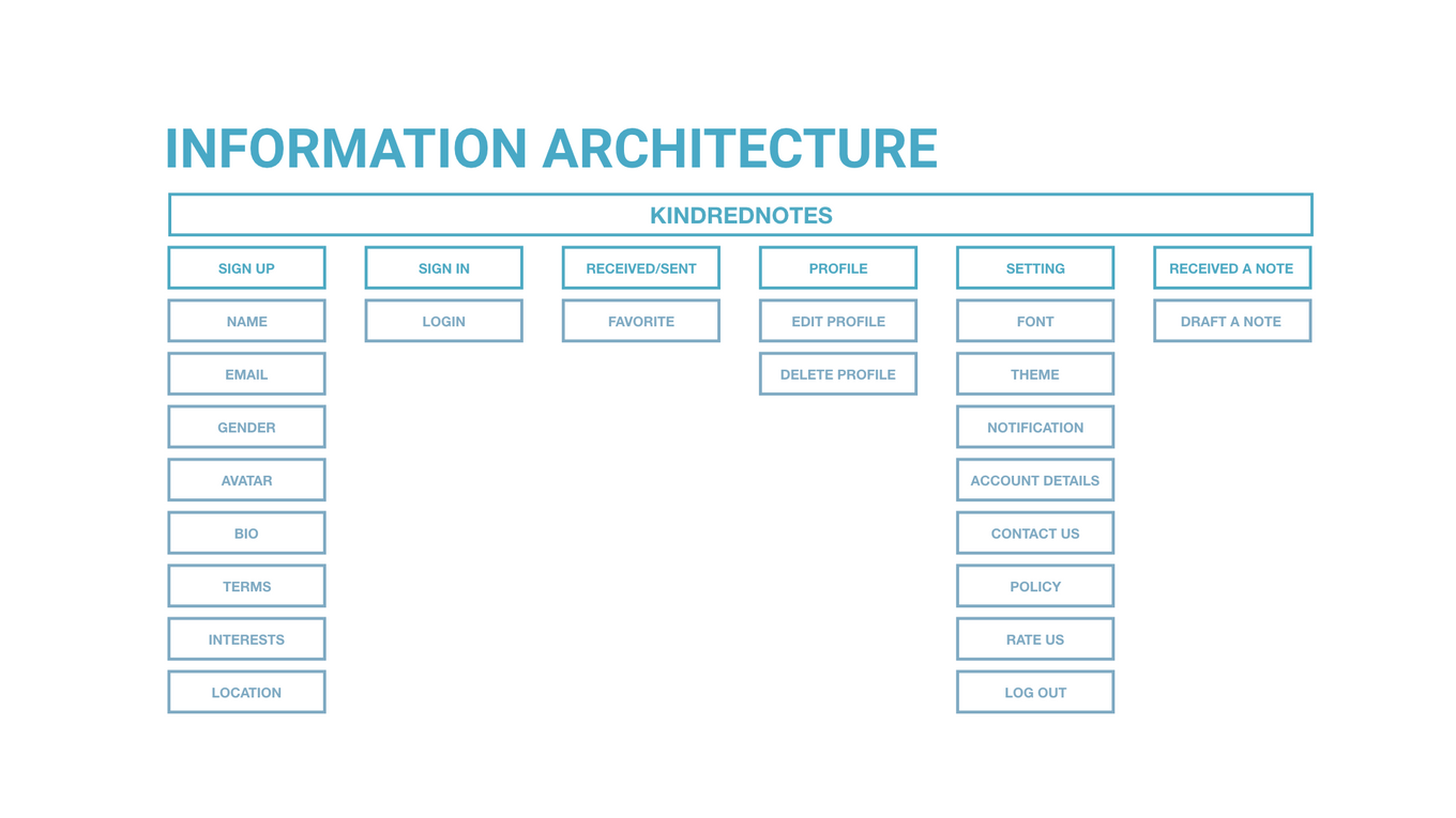
Information Architecture
define the logical structure of the app
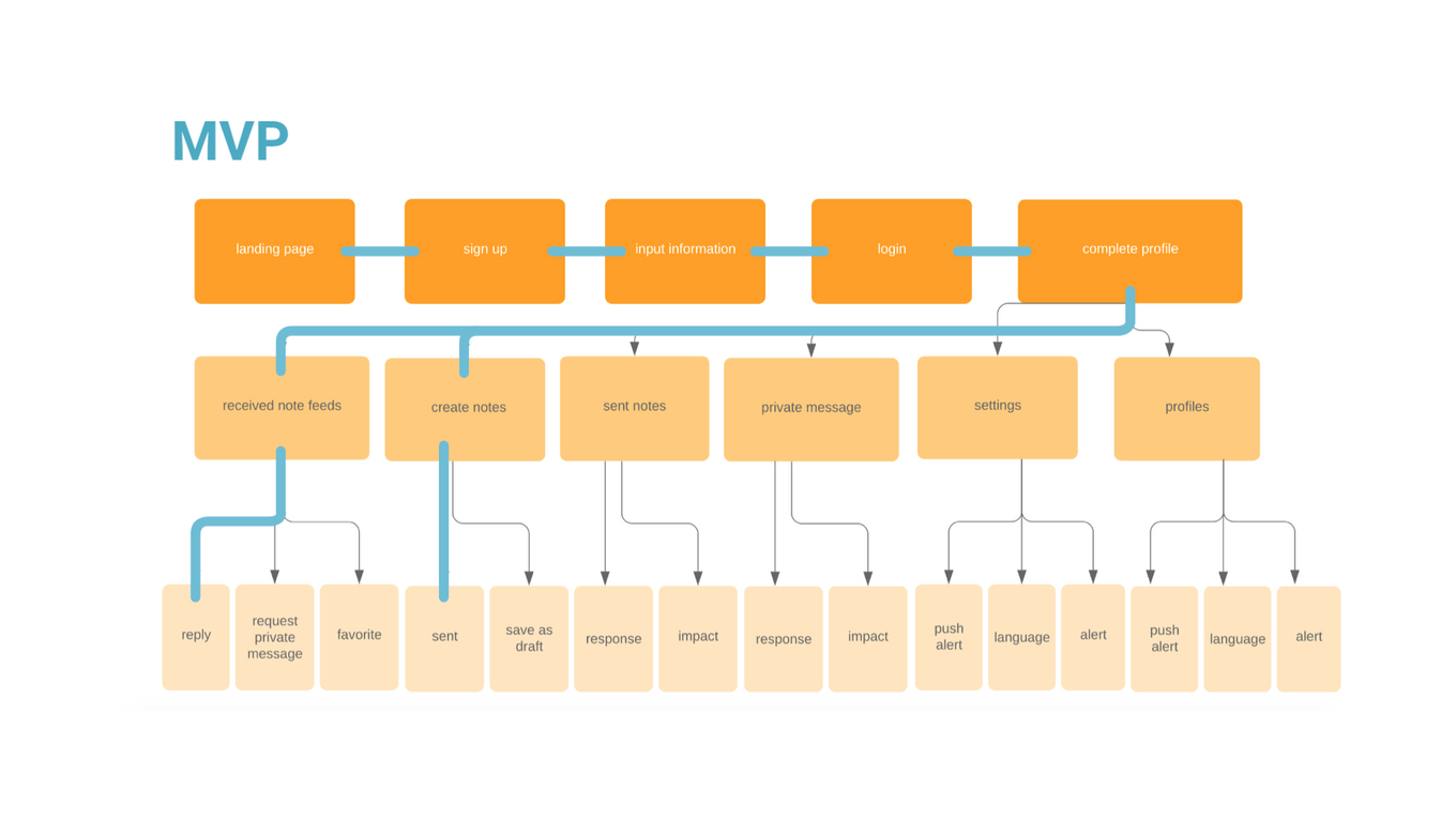
User flow & MVP
Get the best experience user want to have
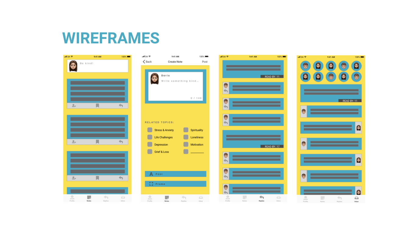
Lo-fidelity wireframes
Kick off and test the theory
user testing
TESTING TO FIND THE TRUE VALUE OF THE PRODUCT
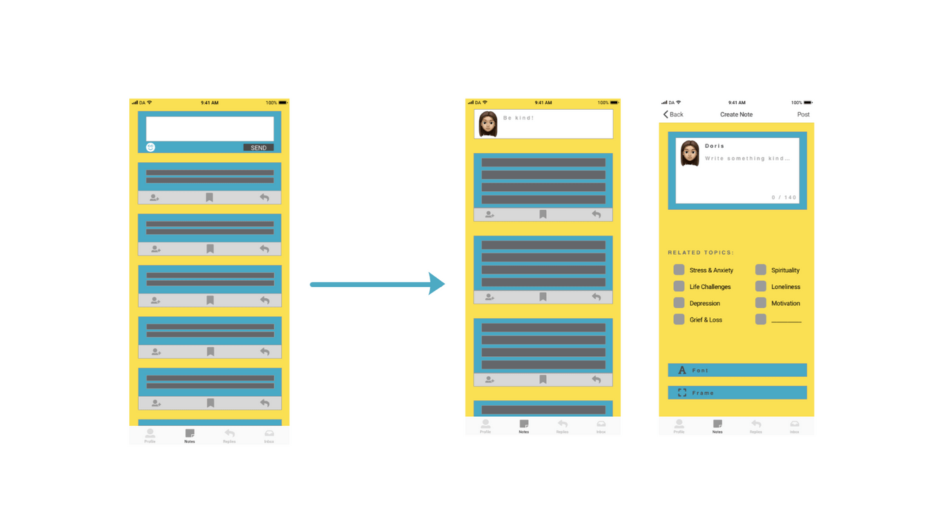
After user testing, there are some improvements made, such as received and sent notes should all go under the same categories. Better to have avatar to recognize which section the user is at. They would like to know the impact of their messages. It is good to have a notification shown that reply is sent successfully, etc.
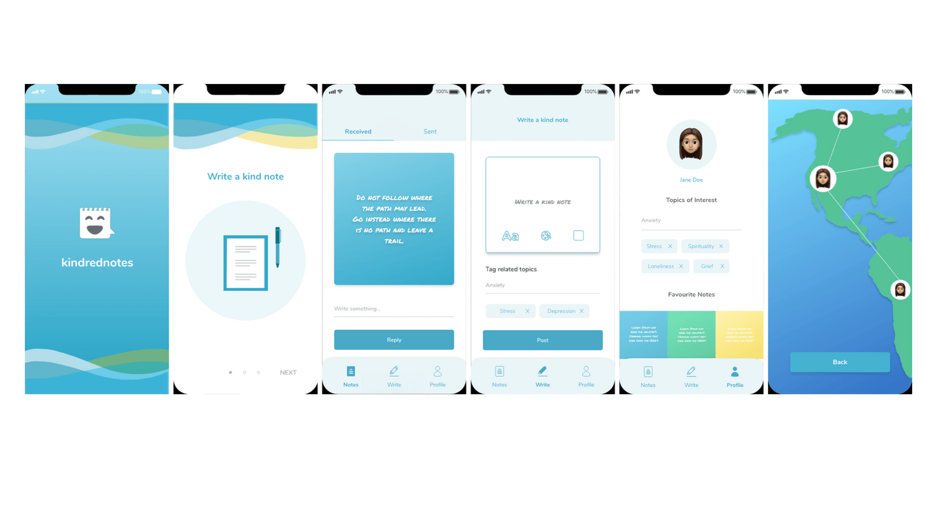
high-fidelity wireframes
final design
